


| Version 18 (modified by , 4 years ago) (diff) |
|---|
Contents
Add JQPlot charts to wiki pages
Description
This macro adds jqPlot based charts to Trac wiki pages. jqPlot is a plotting and charting plugin for the jQuery Javascript framework and is dual licensed under GPL and MIT.
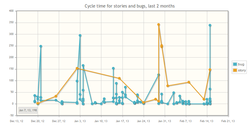
Display dual line plot with title, legend and a date line:

Also note the tooltip at the lower left-hand corner, showing the date, when hovering over the marker in question.
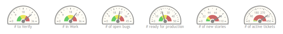
Display multiple gauge meters:

For more examples of the usage of this macro, see section Examples below.
Bugs/Feature Requests
Existing bugs and feature requests for JqChartMacro are here.
If you have any issues, create a new ticket.
| defect |
2 / 3 |
||
|---|---|---|---|
| enhancement |
0 / 1 |
||
| task |
2 / 2 |
Download
Download the zipped source from here.
Source
You can check out JqChartMacro from here using Subversion, or browse the source with Trac.
Installation
General instructions on installing Trac plugins can be found on the TracPlugins page.
Make sure that jqplotchart is enabled in your trac.ini file:
[components]
jqplotchart.* = enabled
Examples
The options element is the jqPlot options parameter. See the jqPlot website for more information.
Gauge chart
This creates a gauge counting the number of rows returned in report number 10:
{{{
#!JQChart
  "type": "MeterGauge",
  "report_id": 10,
  "options" : {
    "seriesDefaults": {
      "rendererOptions": {
        "label": "# bugs",
        "intervals": [4, 8, 12]
      }
    }
  }
}}}
Line chart
This creates a line chart with one series per ticket type. The x axis is the time the ticket was created, and the y axis is a 'cooked' number for demonstration only (the ticket id times 10). Notice that the sql query returns the ticket id. This will make each point in the chart clickable. When you click on a point, you will be sent to the ticket corresponding to that point:
{{{
#!JQChart
  "width": 400,
  "height": 250,
  "query": "select type, time, id * 10, id from ticket order by time",
  "options" : {
    "title": "Creation date of each ticket, by type"
  },
  "series_column": "type"
}}}
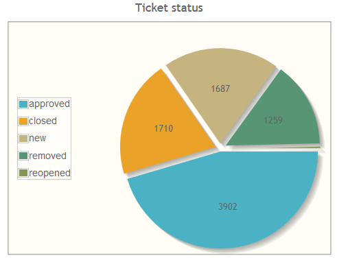
Ticket status as pie chart
The following creates a pie chart showing the number of tickets for each status. Label and grid are hidden.
{{{
#!JQChart
  "type": "Pie",
  "width": 450,
  "height": 350,
  "query": "SELECT status, count(status) AS number FROM ticket GROUP BY status",
  "options": {
      "title": "Ticket status",
      "axes": {
          "xaxis": {
              "drawMajorGridlines": false,
              "numberTicks": 0
          }
      },
      "grid": {
          "borderWidth":1.0,
          "shadow": false
      },
      "seriesDefaults":{
          "rendererOptions": {
              "showDataLabels": true,
              "sliceMargin": 8,
              "padding": 35,
              "dataLabels": "value"
          }
      },
      "legend": {
          "show": true,
          "placement": "inside",
          "location": "w",
          "marginTop": "15px"
      }
  }
}}}

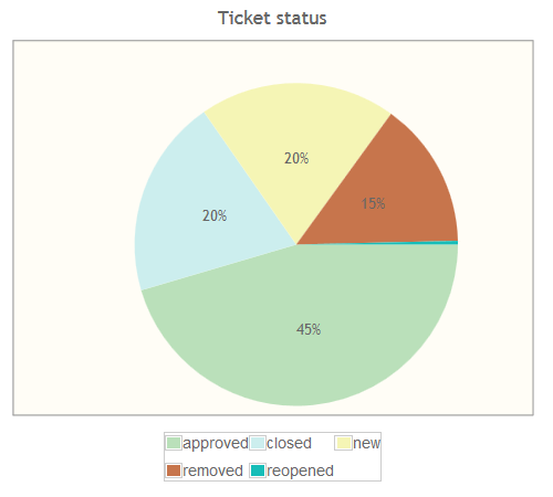
The same chart but using different render options:
{{{
#!JQChart
  "type": "Pie",
  "width": 450,
  "height": 350,
  "query": "SELECT status, count(status) AS number FROM ticket GROUP BY status",
  "options": {
      "title": "Ticket status",
      "axes": {
          "xaxis": {
              "drawMajorGridlines": false,
              "numberTicks": 0
          }
      },
      "grid": {
          "borderWidth":1.0,
          "shadow": false
      },
      "seriesColors":["#bae0ba", "#cee", "#f5f5b5", "#C7754C", "#17BDB8"],
      "seriesDefaults":{
          "rendererOptions": {
              "shadow": false,
              "showDataLabels": true,
              "sliceMargin": 0,
              "padding": 35,
              "dataLabels": "percent"
          }
      },
      "legend": {
          "show": true,
          "placement": "outside",
          "location": "s",
          "marginTop": "15px",
          "rendererOptions": {
              "numberRows": 2
          }
      }
  }
}}}

Recent Changes
Author/Contributors
Attachments (4)
- line.png (52.0 KB) - added by 11 years ago.
- gauge.png (19.4 KB) - added by 11 years ago.
-
ticket_status_pie.png (25.3 KB) - added by 8 years ago.
Ticket status as pie chart
-
ticket_status_pie2.png (15.3 KB) - added by 8 years ago.
Ticket status as pie chart with different render options
Download all attachments as: .zip