


| Version 15 (modified by , 12 years ago) (diff) |
|---|
Contents
Graphs tables and other data using Google Visualization API
Notice: This plugin is unmaintained and available for adoption.
Description
This plugin adds Google Visualization graphs and charts to Trac pages. The most basic usage is graphing an existing report:

See more examples below.
Configuration
- Install the plugin (after downloading and unzipping):
cd visualizationplugin/0.12
sudo python setup.py bdist_egg
sudo cp dist/TracVisualization*.egg /your/trac/location/plugins/
See TracPlugins for more installation details and options. You'll likely need to restart Trac's web server after installation.
- Enable the plugin:
[components]
viz.* = enabled
You can alternatively use the Trac Web Admin GUI to enable any or all rules.
- Configure which pages to include graphs - example:
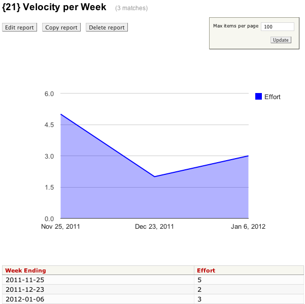
[viz]
reports = 21
The above example will populate an area chart from the table of data found in report 21 and display the chart above that table - see screenshot above. The examples section below shows additional ways to include graphs and charts on Trac pages.
Bugs/Feature Requests
Existing bugs and feature requests for VisualizationPlugin are here.
If you have any issues, create a new ticket.
Download
Download the zipped source from [download:visualizationplugin here].
Source
You can check out VisualizationPlugin from here using Subversion, or browse the source with Trac.
Examples
Existing report
The most basic usage is adding a chart to an existing report - this can be achieved with almost no configuration. Simply list the reports in the [viz] section:
[viz]
reports = 21,23
The plugin will automatically determine the data types for each column. However, the table needs to be structured suitably for graphing. In the screenshot at the top of this page, the table was built by grouping tickets into weeks as follows (sqlite SQL):
SELECT date(tc.time/1000000, 'unixepoch', 'weekday 5') as "Week ending",
  SUM(CASE e.value
          WHEN '' THEN 0
          ELSE e.value END) AS effort
  FROM ticket t
    JOIN ticket_change tc ON tc.ticket = t.id AND tc.field = 'status' AND tc.newvalue='closed'
           AND tc.time=(SELECT max(time) FROM ticket_change tc2
                                 WHERE tc2.ticket = t.id AND tc2.field = 'status' AND tc2.newvalue='closed')
  LEFT OUTER JOIN ticket_custom e ON e.ticket = t.id and e.name = 'effort'
  WHERE resolution = 'fixed' AND t.type != 'epic'
  GROUP BY date(tc.time/1000000, 'unixepoch', 'weekday 5')
  ORDER BY date(tc.time/1000000, 'unixepoch', 'weekday 5')
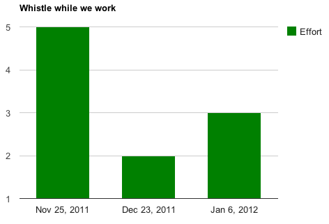
If you prefer a column chart instead of the default area chart, you can change the chart type as follows:
[viz]
reports = 21,23
type = ColumnChart
The type name must exactly match those supported by the Google Visualization API here (no spaces). You can also customize all of its options available for that chart type. For example, the ColumnChart type's options can be found here. So if we wanted to add a title and change the color for the same table as shown in the screen at the top of this page, we can do this:
[viz]
reports = 21,23
type = ColumnChart
options = width:600,height:400,colors:['green'],title='Whistle while we work'

Existing report, different charts per report
You will likely want to customize the charts in different reports differently. To do that, create a new section for the reports instead of including them in the main [viz] section's reports option:
[viz]
options = width:600,height:400

[viz.report/21]
type = ColumnChart
options = colors:['green'],title='Whistle while we work'

[viz.report/23]
type = AreaChart
options = colors:['red'],title='Bugs baby!'
The above customizes reports 21 and 23 differently. Report 21 will be a green column chart with the given title, and report 23 will be a red area chart with its given title. Both charts will inherit the [viz] section's width and height, however.
Important: whereas the
optionsoption adds to the[viz]section'soptions, all other options (e.g.,type) override the[viz]section's options.
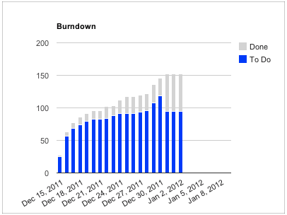
Burndown chart on Milestone page
In the examples above, the data for the charts came from a report table found on the same page. You can also create charts by querying remote data sources for the data using data sources that conform to the Google Visualization Data Source API. One such example is SumStats plugin which provides a burndown data source amenable to graphing on any milestone page. For example:
[viz.milestone]
# Burndown
type = ColumnChart
options = width:400,height:300,title:'Burndown',colors:['blue','lightgray'],isStacked:true,backgroundColor:{strokeWidth:1,stroke:'#999'}
source = https://trac.mycompany.com/sumstats/query
selector = #stats fieldset
The above will add a burndown chart to your milestone pages just above the stats drilldown section:

In the configuration above, the source was set to the data source (in this case the sumstats plugin) and the selector specifies before which DOM element the graph should be inserted. You can position the graphs anywhere by selecting an appropriate selector.
See the SumStats plugin for details on how to configure it for alternative visualizations (e.g., by adding a query to specify the columns to return and their order).
Recent Changes
Author/Contributors
Author: robguttman
Maintainer: robguttman
Contributors:
Attachments (3)
- effort.png (36.0 KB) - added by 12 years ago.
- whistle.png (12.9 KB) - added by 12 years ago.
- burndown.png (22.9 KB) - added by 12 years ago.
Download all attachments as: .zip