#13604 closed defect (fixed)
Adapt vertical alignment
| Reported by: | Massimo | Owned by: | Cinc-th |
|---|---|---|---|
| Priority: | normal | Component: | LoomingCloudsPlugin |
| Severity: | normal | Keywords: | |
| Cc: | Trac Release: | 1.2 |
Description (last modified by )
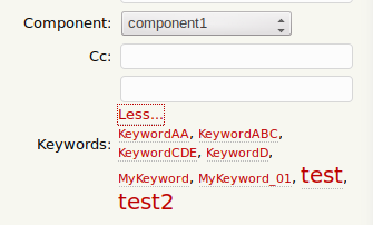
Please adapt the vertical alignment of the Keywords-title when using LoomingCloudsPlugin. It is currently centered but should be top-aligned in my opinion.
Attachments (1)
Change History (7)
Changed 7 years ago by
| Attachment: | Screenshot_2019-09-05_08-06-06.png added |
|---|
comment:1 Changed 7 years ago by
| Description: | modified (diff) |
|---|
comment:2 Changed 7 years ago by
The label is centered by Trac (probably ticket.css). I seem to recall we discussed it quite a bit before deciding to center the label. The fields aren't meant to take up so much vertical space.
comment:3 follow-up: 6 Changed 7 years ago by
I think the UI design of this plugin is bad. The cloud doesn't fit well underneath the Keywords field. Instead, maybe we could have an icon with a popover that shows the tag cloud when clicked on. Or maybe Keyword autocomplete is sufficient and this plugin isn't even needed.
What do you think would be a good UI design for a tag cloud on the ticket page?
comment:4 Changed 7 years ago by
For now, having the field title top-aligned with the edit field instead would help a lot. Currently the title is aligned with the looming cloud and for users it is not clear that the keyword edit field together with the looming cloud is one "widget". Or just make the looming cloud being its own field and not combined with the keyword field itself. But I'm no expert in the html layouts.
comment:5 Changed 5 years ago by
| Owner: | set to Cinc-th |
|---|---|
| Resolution: | → fixed |
| Status: | new → closed |
In 18234:
comment:6 Changed 5 years ago by
Replying to Ryan J Ollos:
I think the UI design of this plugin is bad. The cloud doesn't fit well underneath the Keywords field. Instead, maybe we could have an icon with a popover that shows the tag cloud when clicked on. Or maybe Keyword autocomplete is sufficient and this plugin isn't even needed.
What do you think would be a good UI design for a tag cloud on the ticket page?
UI design is hard. While the current design may not be perfect, I think it's at least Ok-ish (with my slight improvements in [18234] which are better positioning and more horizontal space for the tag cloud).
My 2 cents fuelled by creating plugins for a group of software devs:
- everything hidden behind a click won't be used at all.
- Discovery of something by beginning to type in a field won't work. The field won't be used at all for fear of doing something wrong or because of "why should I insert something here, it doesn't solve my current problem and it is more work for me coming up with clever tag ideas"
- (At least our) devs don't play around in their tools, so they would never see a popover on an icon.
- Have valid choices/the desired feature just a single click away helps because it reduces cognitive load of the user.
- Explain everything in place or a feature won't be used for fear of doing it wrong or creating more work by using it, thus have a help text (a popover doesn't work).
I see the following improvements for the future:
- Order the tag cloud by most used tags first.
- Hide the
More...link if all tags are already visible.


Keywords with LoomingCloudsPlugin