


#5481 closed enhancement (duplicate)
Position Change button below the Reply button and change styling to match Reply button
| Reported by: | anonymous | Owned by: | Sergei Luchko |
|---|---|---|---|
| Priority: | normal | Component: | TicketChangePlugin |
| Severity: | normal | Keywords: | |
| Cc: | Ryan J Ollos | Trac Release: | 0.11 |
Description
I think the look and feel would be better if the Change button where positioned below the Reply button. Having the Change button positioned to the left of the Reply button reduces the number of usable columns in the comment box.
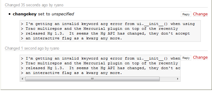
This can be seen in the attached example, !TicketChangeExample1.png. I'm using the EmailProcessorMacro and you can see that in the first comment the formatting nice because there was a ticket change comment added to the first line. In the second comment a scroll box is added to the Email block because the Change button is taking up some of the usable column space.
This is somewhat related to ticket #4454 in terms of enhancing the appearance of the Change button.
Attachments (1)
Change History (5)
Changed 17 years ago by
| Attachment: | TicketChangeExample1.png added |
|---|
comment:1 Changed 17 years ago by
| Cc: | Ryan J Ollos added; anonymous removed |
|---|
comment:2 Changed 16 years ago by
comment:3 Changed 16 years ago by
| Summary: | Position Change button below the Reply button → Position Change button below the Reply button and change styling to match Reply button |
|---|
#4454 contains some CSS for changing the styling of the Change button.
comment:4 Changed 16 years ago by
| Resolution: | → duplicate |
|---|---|
| Status: | new → closed |
Closing this ticket instead as a duplicate of #4454, and re-opening that ticket.
See also #4454.