Modify ↓
Opened 14 years ago
Closed 14 years ago
#9557 closed enhancement (fixed)
Wider drop down text area
| Reported by: | Ryan J Ollos | Owned by: | yosiyuki |
|---|---|---|---|
| Priority: | normal | Component: | BookmarkPlugin |
| Severity: | normal | Keywords: | |
| Cc: | Jun Omae | Trac Release: | 0.11 |
Description
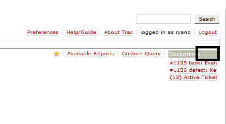
The drop-down list has a fixed width. I'm not sure if this is possible, but it would be very nice if the width of the drop-down list expanded to fit the width of the longest entry in the box, provided this could be done without expanding the width of the Bookmark entry on the contextual navigation. In fact, the Bookmark entry could be made a bit narrower since there is some unused space, as shown in this screen capture:
Attachments (1)
Change History (3)
Changed 14 years ago by
| Attachment: | Bookmarks.png added |
|---|
comment:1 Changed 14 years ago by
| Cc: | Jun Omae added; anonymous removed |
|---|
comment:2 Changed 14 years ago by
| Resolution: | → fixed |
|---|---|
| Status: | new → closed |
Note: See
TracTickets for help on using
tickets.


(In [11893]) bookmarkplugin:
#ctxtnavhas fluid width and fits the width of bookmarks dropdown#bookmark_menu